Responsiveness
These are key principles and guidelines for ensuring that designs created using Amigo are responsive and provide consistent experiences across different devices.
Takeaways
- Amigo has responsive breakpoints for small, medium and large screens.
- Amigo's 12-column layout grid guides how elements adjust at different screen sizes.
- The arrangement and visibility of components can adjust as screen sizes change.
- As screen sizes changes, components with similar functions can be swapped.
- Use real devices for testing as they represent the user experience more accurately.
Breakpoints
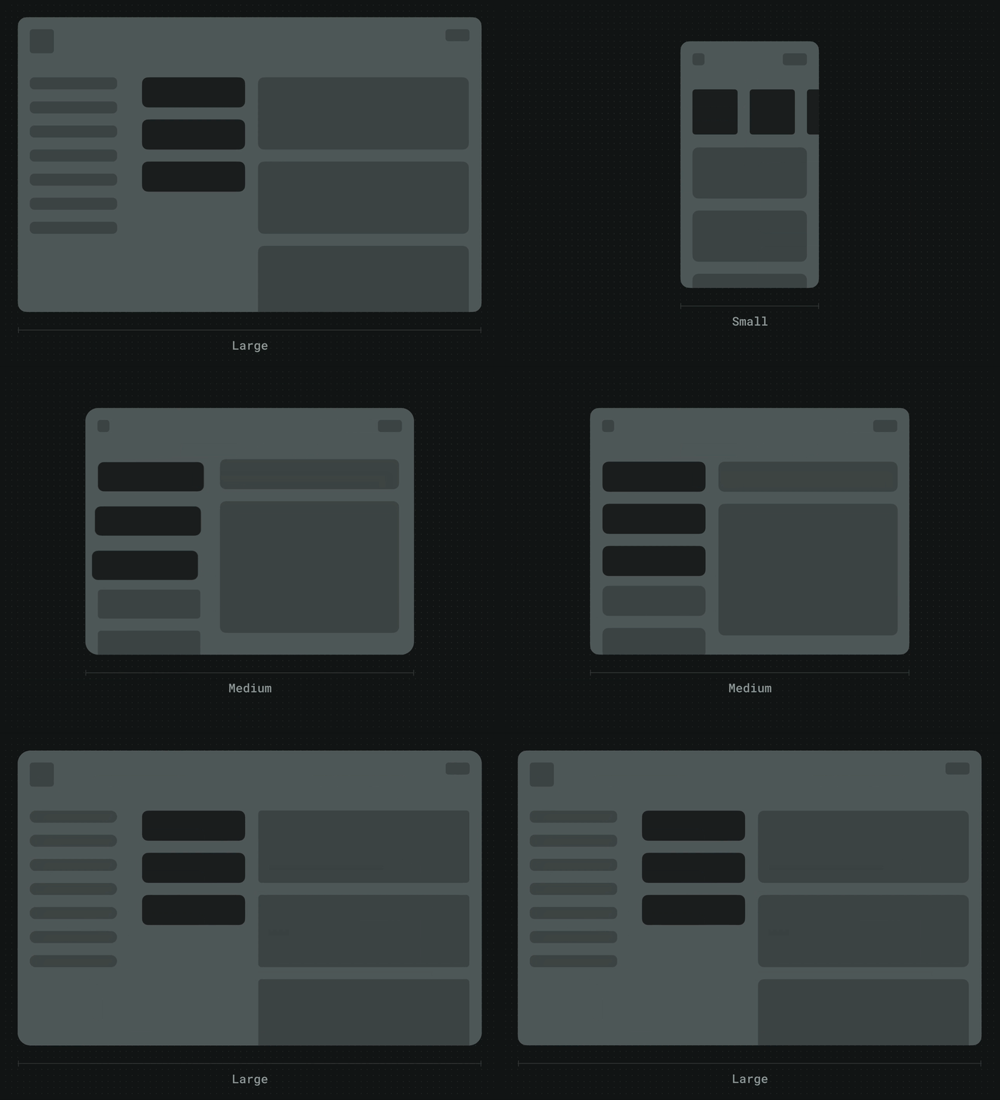
A breakpoint is a specific screen size at which the layout changes to ensure optimal display on different devices. Amigo has 3 breakpoints to ensure seamless responsive design across different devices:
| Breakpoint | Size | Side navigation |
|---|---|---|
| Small | 360 – 767px | Collapsed |
| Medium | 768 – 1279px | Collapsed |
| Large | 1280px and above | Visible |
Layout grid
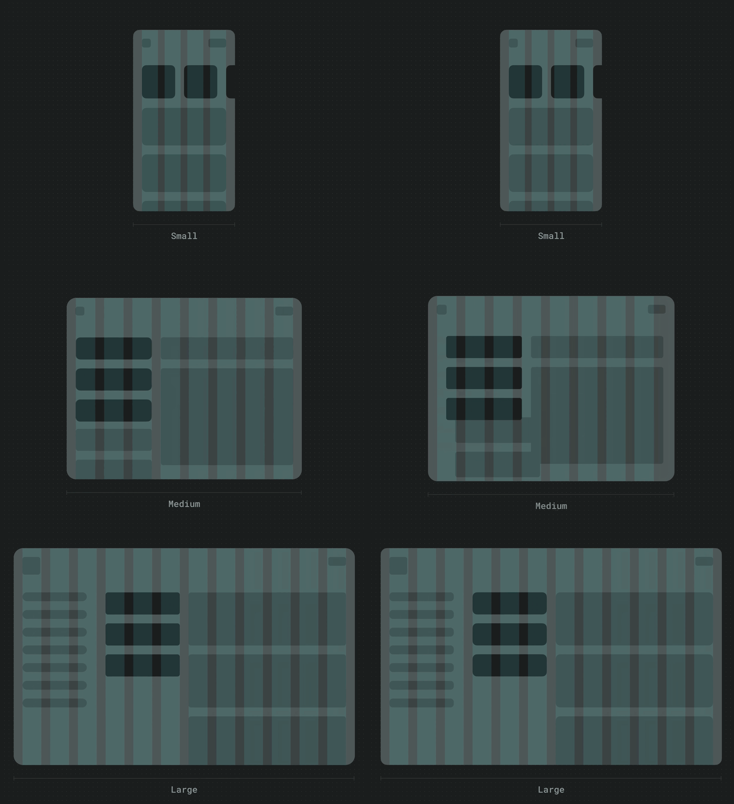
Amigo uses a 12-column grid system to ensure consistent layout across different devices. Note: the following layout grid guidelines have been only partially adopted in Go. Some rules and values might not match the design specs in Figma.
| Breakpoint | Columns | Margin | Gutter |
|---|---|---|---|
| Small | 4 | 16 | 16 |
| Medium | 8 | 20 | 16 |
| Large | 12 | 24 | 16 |
Responsive patterns
The arrangement of components in a layout can also adjust with changes in screen sizes. This adaptation occurs either by repositioning components or concealing/revealing them based on available screen space.
Side navigation
In small and medium breakpoints, the side navigation menu is collapsed to optimize the use of screen space. While collapsed, a hamburger menu icon is shown, which opens the menu as a side sheet when tapped.
In desktop breakpoints and above, the side navigation menu is permanently expanded on the screen. This provides quick access to the navigation options.
Component reposition
Components can reflow or reposition as screen size changes to make use of additional space on a larger screen. Repositioning is also a way to accommodate ergonomic and input needs that change across device sizes.
 Note how you can reposition elements as screen size changes.
Component swapping
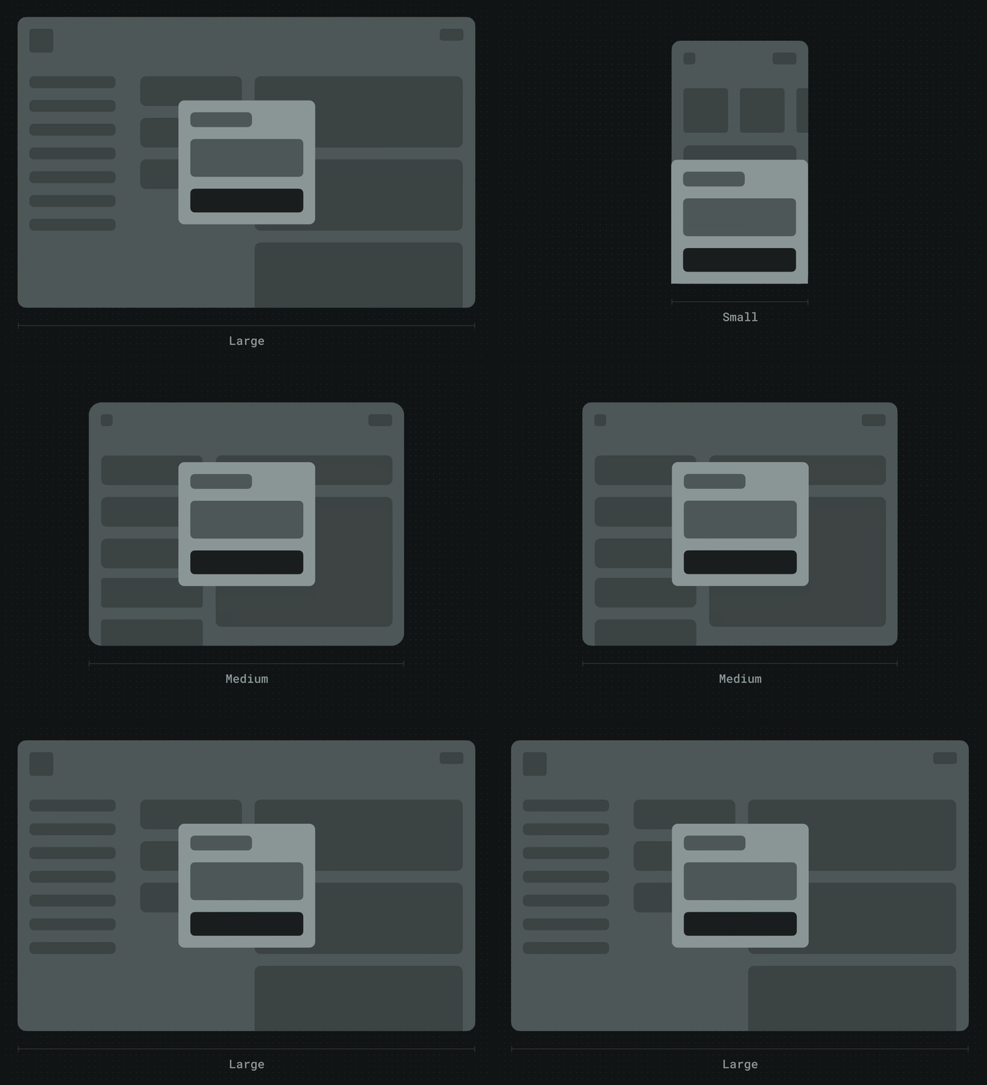
As layout changes across screen sizes, components with similar functions can also be exchanged. This is useful
Bottom sheets vs dialogues
In mobile breakpoints or lower, you can use bottom sheets to display content or ask for user input. As they are more reachable than dialogues, bottom sheets are often a better option than dialogues on small screens.
In tablet breakpoints or higher, though, bottom sheets should be swapped with dialogues.
Modals vs side sheets
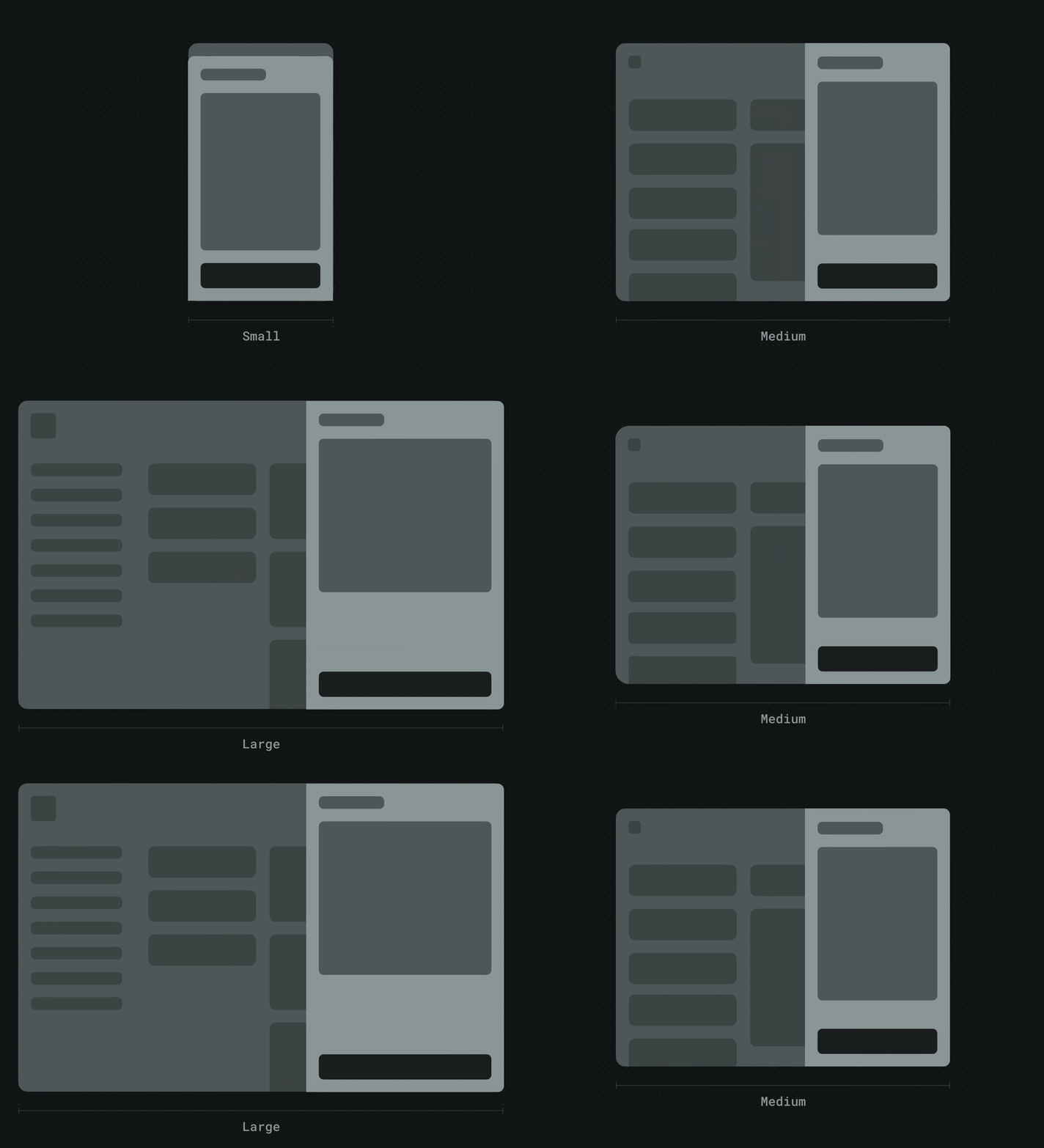
In mobile breakpoints or lower, Amigo uses full-screen modals to show content on top of the active screen. This ensures that the content is easily viewable on smaller screens.
In tablet and desktop breakpoints, content is usually shown using side sheets instead of full-screen modals. This provides more efficient use of screen space, allowing vendors to access both the active screen and the content being displayed.
Testing and QA
Testing for responsiveness is crucial to ensure that vendors using different device sizes have a consistent and high-quality experience. Here are some tips for testing:
- Test on real devices. Browers' dev tools are helpful in simulating different screen sizes quickly, but they only simulate content display and behavior, and may not accurately represent the actual user experience.
- Test the layout, elements, and navigation in both portrait and landscape orientations.
- Pay attention to the behavior of the app at different breakpoints.
- Check for horizontal and vertical scrolling.