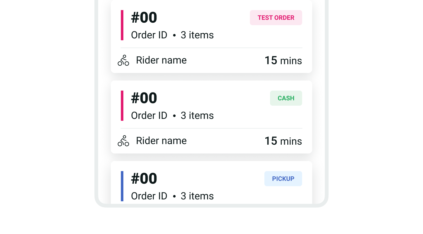
Label
A label is a visual indicator used to highlight an item's status or communicate non-actionable, supplemental information.

Takeaways
- Labels are most commonly used for order-related information, such as to indicate different order types and communicate success or failure status.
- Use medium-sized labels by default, and reserve the smaller variation for dense components or spaces.
Types
Labels have different types to communicate different statuses and types. They also come in three sizes for different use cases.

| Type | Purpose |
|---|---|
| Default | Use to communicate general, non-critical status information. |
| Success | Use to communicate positive or success status, such as order completed. It's also used for payment-related information (e.g. cash payment or commission payment). |
| Failure | Use to communicate critical or failure status, such as order cancelled. |
| Pickup | Use exclusively to identify Pickup orders. |
| Branded | Use to communicate general status and types, such as test orders or optional order items. |
Sizes
| Size | Purpose |
|---|---|
| Small | Use inside dense components where space is limited, such as order tiles or lists. |
| Medium | Standard label size for general use. |
| Large | Use when it's important to bring extra attention to a label. |
Icon only
You can also display an icon instead of text when appropriate. This variation only supports default-style colors and should be used sparingly, as icons often don't provide the same clarity as text.