Dialog
Use Dialogs to elicit a response from the user. They inform users about critical information, require users to make decisions or involve multiple tasks.
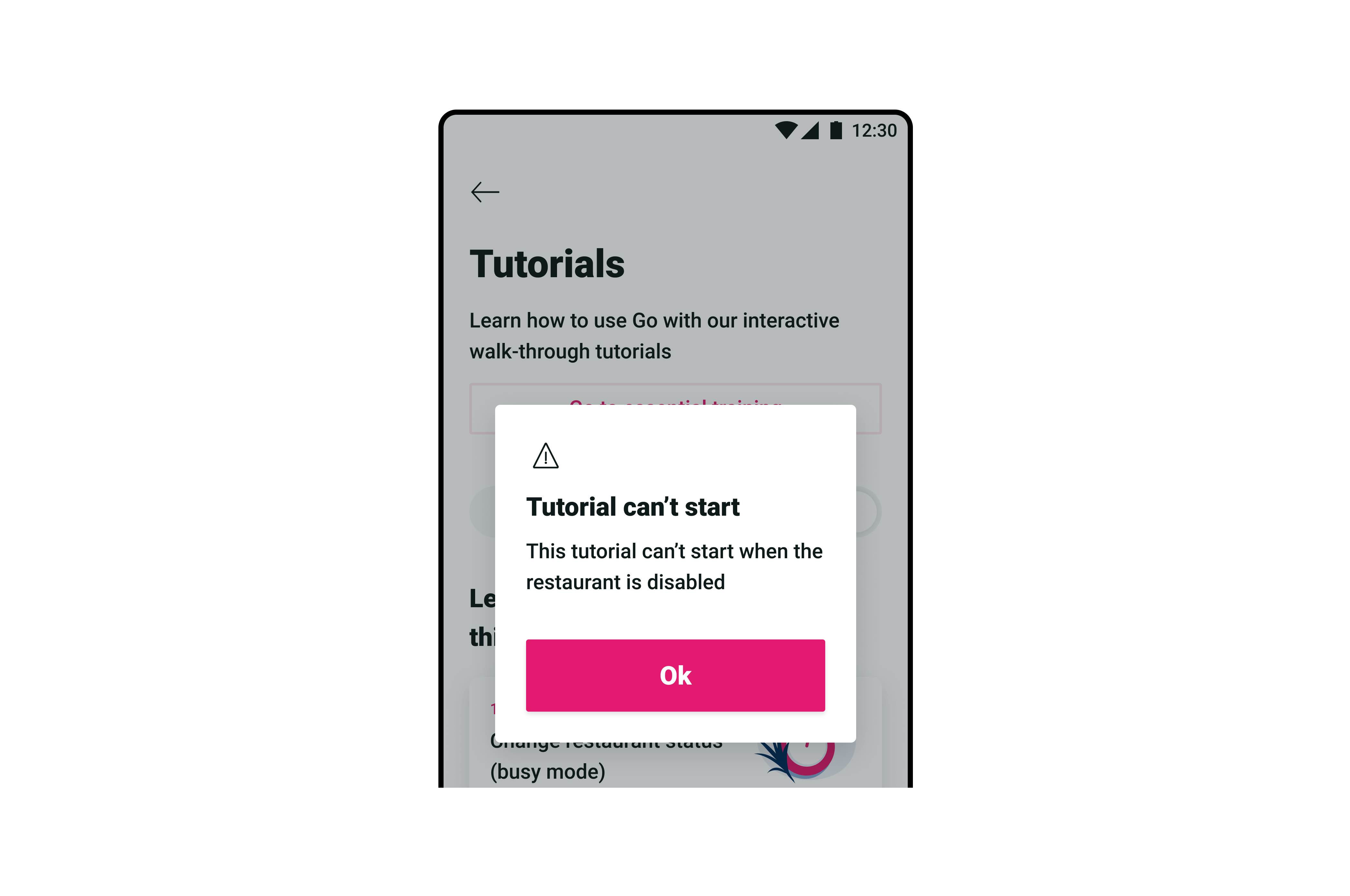
Sizes
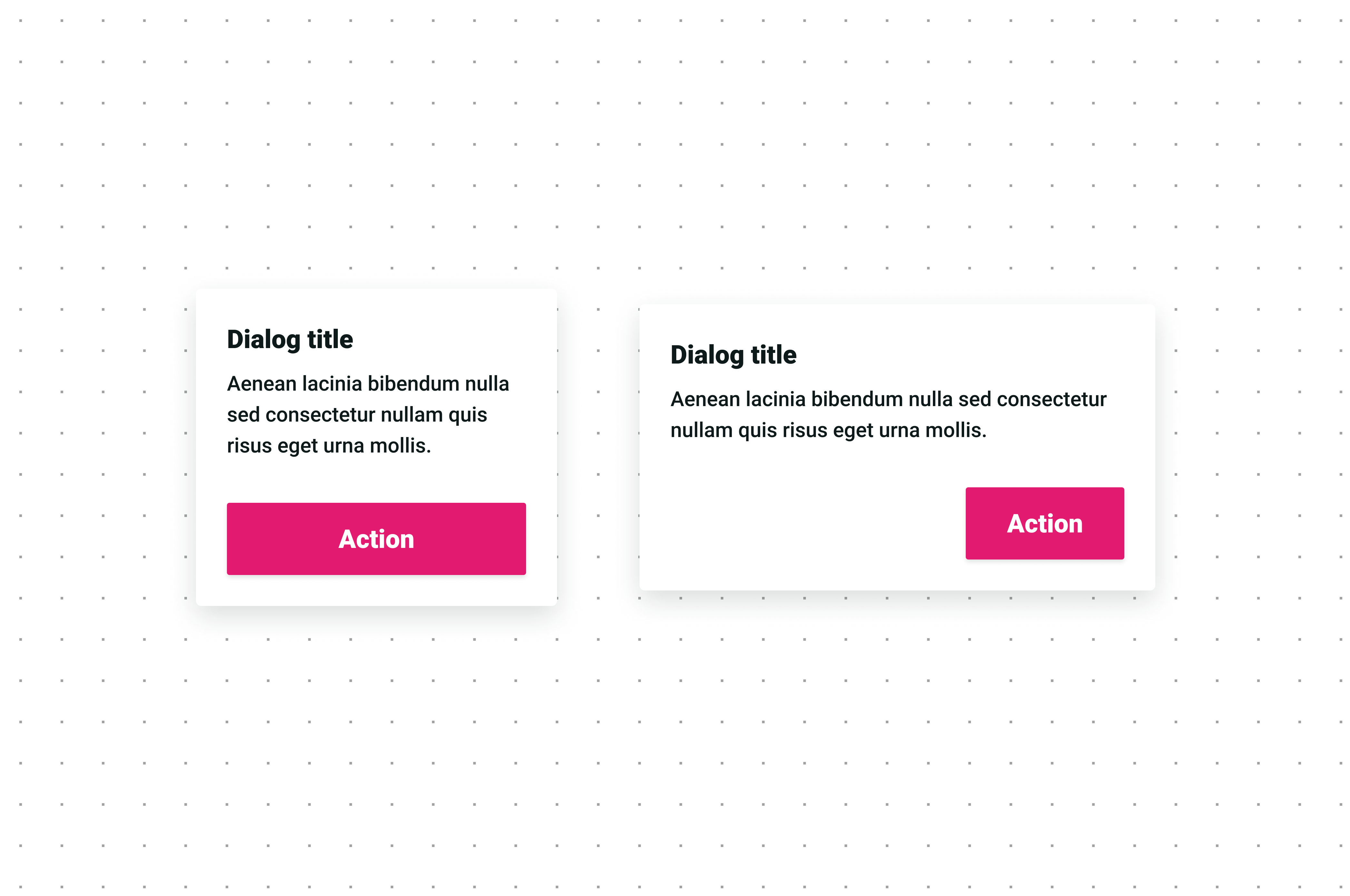
| Size | Use case |
|---|---|
| Portrait | For mobile-size screens. |
| Landscape | For tablet and desktop-size screens. |
Form variatins
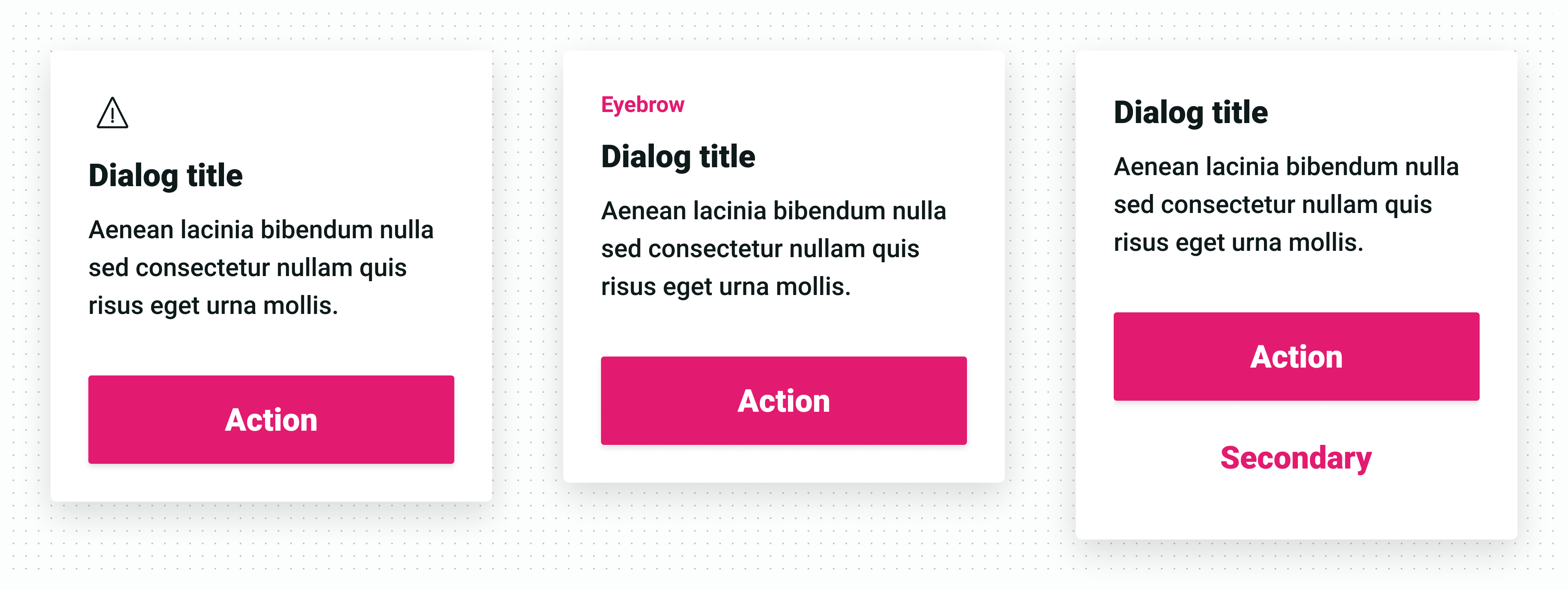
| Variation | Use case |
|---|---|
| With icon | Used to convey user’s attention for important messages such as warnings. |
| With eyebrow | Eyebrows could also act similarly to icons when it’s more suitable to place a small text instead of an icon. |
| With two actions | Used for situations when two actions are needed. |
Anatomy
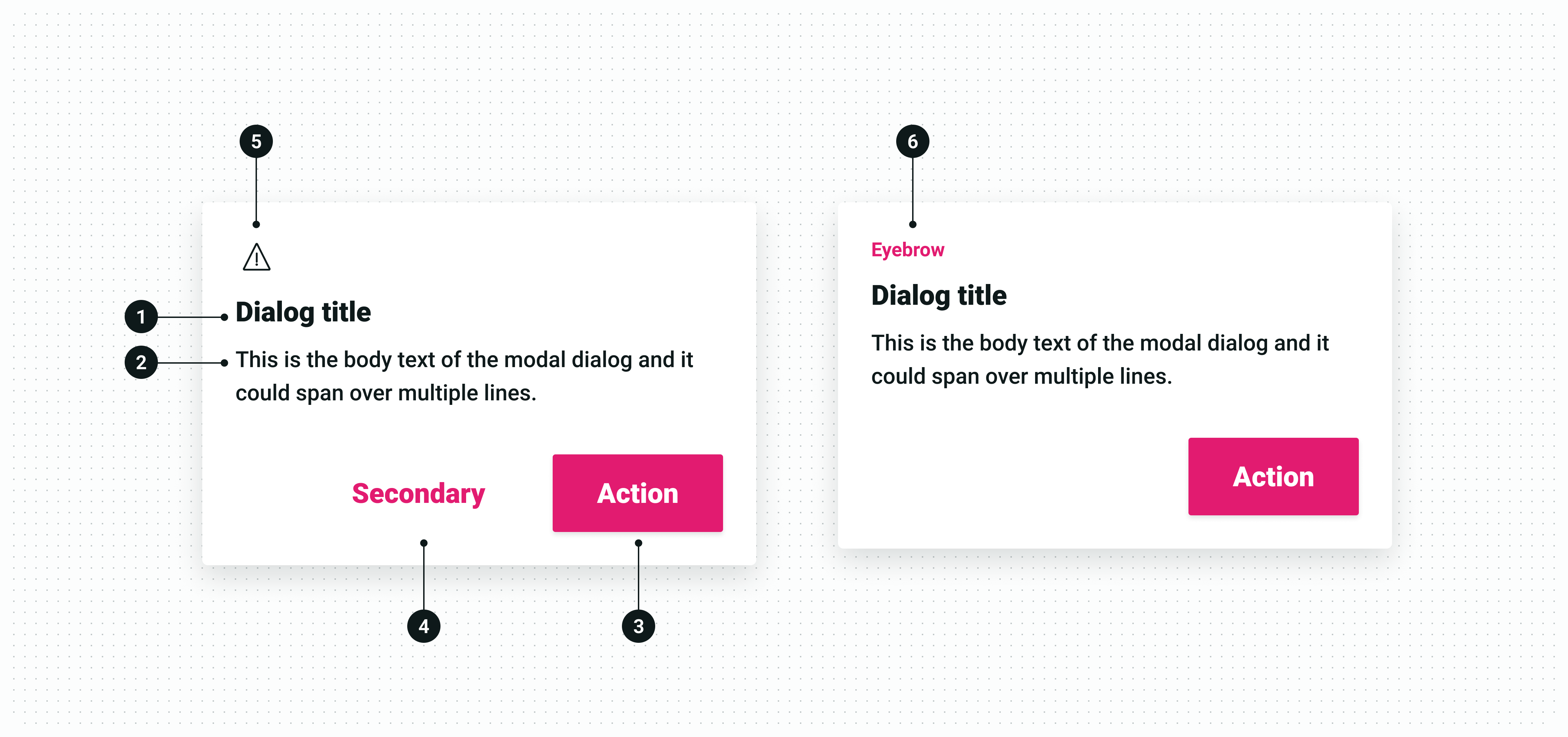
| State | Use case |
|---|---|
| 1. Title | Mandatory heading that conveys the purpose of the message. |
| 2. Body | Mandatory text that conveys the details of the message. |
| 3. Primary action | Mandatory button that allows users to interact with the message. |
| 4. Secondary action | Optional button that provides extra interaction options when needed. |
| 5. Icon | Optional visual cue that could provide more context to the message. |
| 6. Eyebrow | Optional text cue that could provide more context to the message. |
Content guidelines
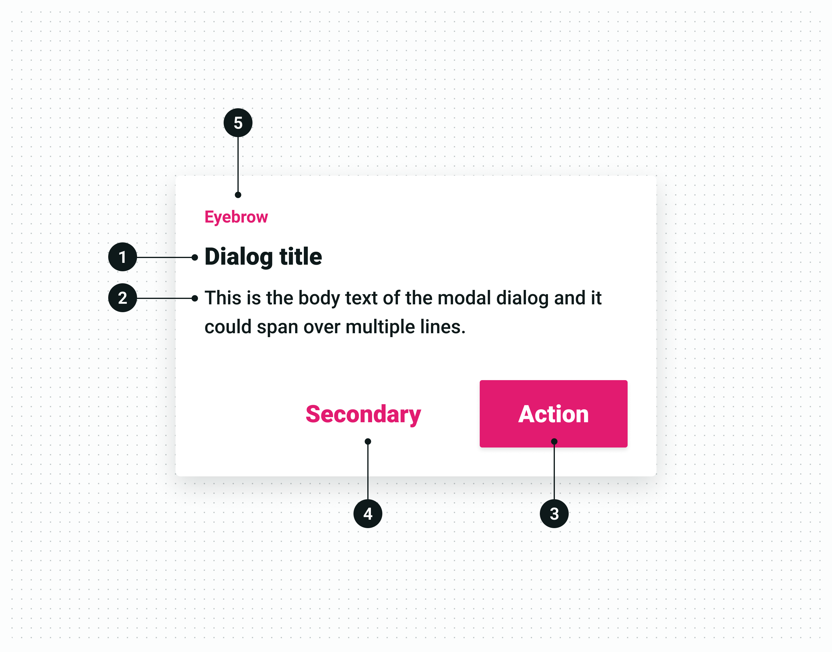
| Text | Guide lines |
|---|---|
| 1. Title | Use short concise language. |
| 2. Body | Place further explanation or complementary information to the title. |
| 3. Primary action | Use this action to make sure the vendor has understood the implications carried in the title and body interactively. |
| 4. Secondary action | Use this action optionally in situations where two actions could be taken or to allow vendors to hold back on the current action. |
| 5. Eyebrow | Use short concise text to give context to the dialog. |