Floating button
Floating buttons are shown on top of all other content of a component or screen. They can be used to open a Floating menu or to overlay actions on top of another element.
Color
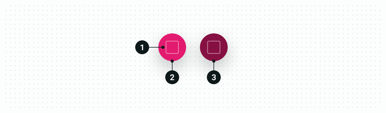
| Element | Property | Color token |
|---|---|---|
| 1. Icon | Fill | $color-icon-on-branded |
| 2. Container | Background | $color-action-brand-primary |
| 3. Container (hover) | Background | $color-action-brand-primary-hover |
Structure
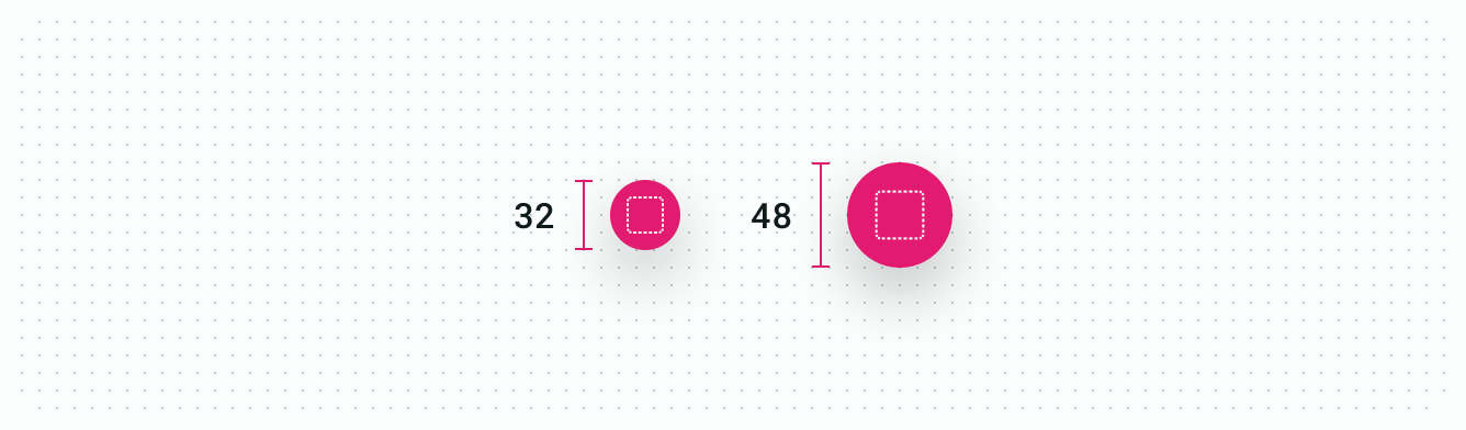
Size
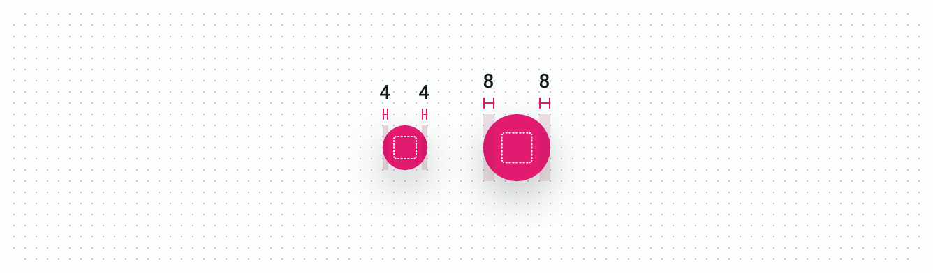
Spacing