Floating button
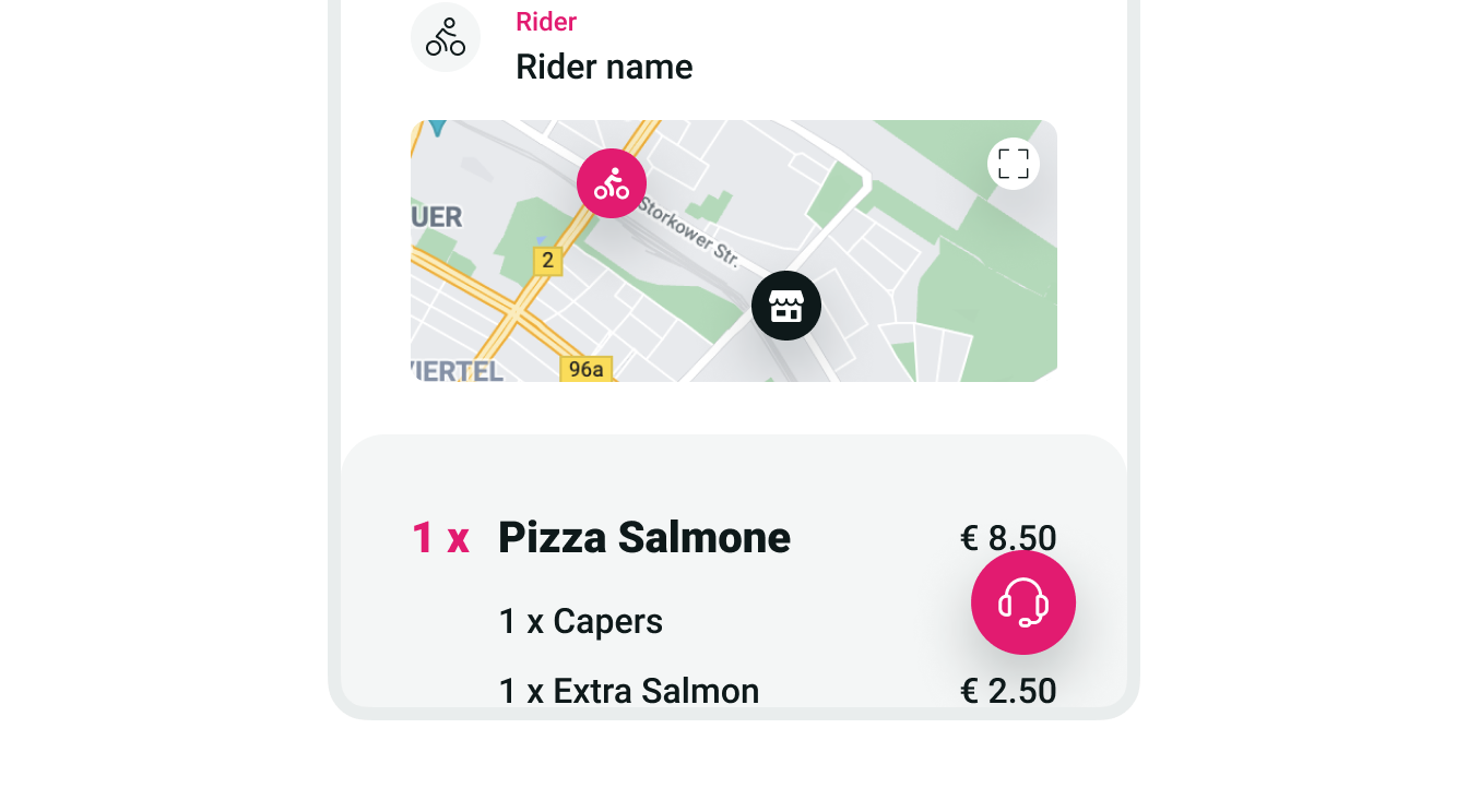
Floating buttons are shown on top of all other content of a component or screen. They can be used to open a Floating menu or to overlay actions on top of another element.

Key points
- The large Floating button is reserved for opening Floating menus. They should be placed on the bottom-right corner of a screen. Don’t use it for other purposes or in other locations.
- Small Floating buttons can be used for different purposes and be placed at different locations, such as on top of a map to indicate rider and vendor positions.
Types

| Type | Purpose |
|---|---|
| Small | Use to overlay actions on top of other content within a component. One example is showing actions on top of a map. |
| Large | Reserved for opening Floating menus. |