Button
Buttons help vendors initiate actions, from opening their store to accepting and marking orders as ready for delivery.

Variants
Go provides different button variants with specific prominence levels. Choosing the right variant helps users quickly identify where to click and perform their tasks with as little effort as possible.

| Variant | Purpose |
|---|---|
| Primary | Main call to action on a screen. Primary buttons should only be used once per screen. |
| Secondary | Secondary buttons are usually used inside other components, such as inside cards, to give users additional functionality. Do not use secondary buttons as the main action of the screen. |
| Tertiary | For less important actions on a screen. Tertiary buttons can be used alone or paired with a primary button, where they serve as cancelling actions. They can also be used inside other components, such as cards and list items. |
Roles
Buttons also come with different roles. Since each role communicates a different purpose to users, they must be used consistently across the product to message the correct actions.

| Role | Purpose |
|---|---|
| Default | Default buttons are the most common actions. They are automatically given the platforms' brand color and are used to perform standard actions, such as confirming prompts, continuing flows or navigating to other views. |
| Danger | For critical actions that can have destructive effects, such as declining an order. |
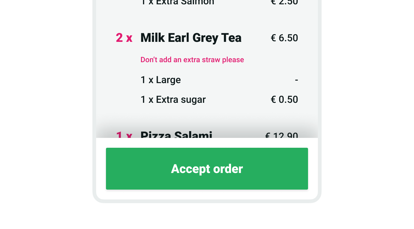
| Success | Used exclusively for accepting orders. |
| Info | Used exclusively for order updating actions (e.g. marking orders as ready or picked up) |
| Neutral | For actions with no specific semantic role and that might not work well as default (branded) buttons, such as "Yes" and "No" buttons. Using default (branded) buttons for these might cause usability issues, as some brands use reds and greens. |
Sizes

| Size | Use case |
|---|---|
| Small | Use inside dense or compact components, such as list items or order tiles. |
| Medium | For actions placed inside other components. |
| Large | Standard button size for main buttons on a screen. |
States

Anatomy

| State | Use case |
|---|---|
| 1. Label | Mandatory button label text |
| 2. Icon | Optional icon shown at the ending edge of the button. |
| 3. Secondary text | Optional text element used to provide extra context (e.g. number of items in the "Accept order" button) |
Content
Text labels
Button labels should clearly indicate the action of the button. To provide enough context, use the {verb} + {noun} content formula on buttons except in the case of common actions like “Done”, “Close”, “Cancel”, “Add”, or “Delete”.
There are exceptions to this rule for situations in which button length could cause problems in compact UIs or negatively impact translation, but the {verb} + {noun} formula is still best practice.