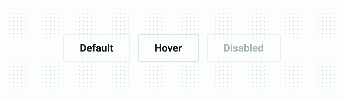
Button
Buttons help vendors initiate actions, from opening their store to accepting and marking orders as ready for delivery.
Color
Primary button
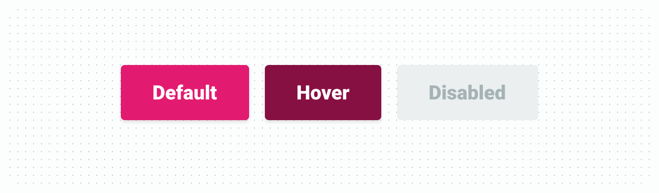
| Element | Property | Color token |
|---|---|---|
| Label | Text | $color-text-on-branded |
| Container | Background | $color-action-brand-primary |
| Container (hover) | Background | $color-action-brand-primary-hover |
| Container (disabled) | Background | $color-action-disabled |
| Label (disabled) | Text | $color-text-disabled |
Secondary button
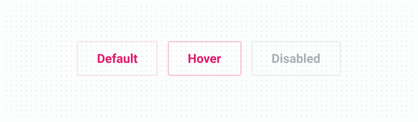
| Element | Property | Color token |
|---|---|---|
| Label | Text | $color-action-brand-primary |
| Container | Border | $color-action-brand-secondary |
| Container (hover) | Border | $color-action-brand-secondary-hover |
| Container (disabled) | Border | $color-border-normal |
| Label (disabled) | Text | $color-text-disabled |
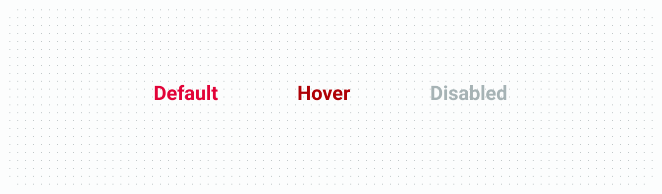
Tertiary button
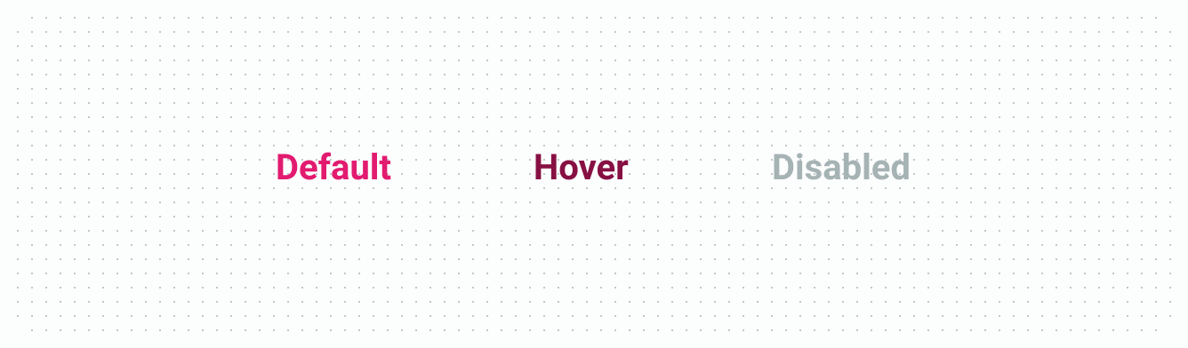
| Element | Property | Color token |
|---|---|---|
| Label | Text | $color-action-brand-primary |
| Label (hover) | Text | $color-action-brand-primary-hover |
| Label (disabled) | Text | $color-text-disabled |
Primary danger button
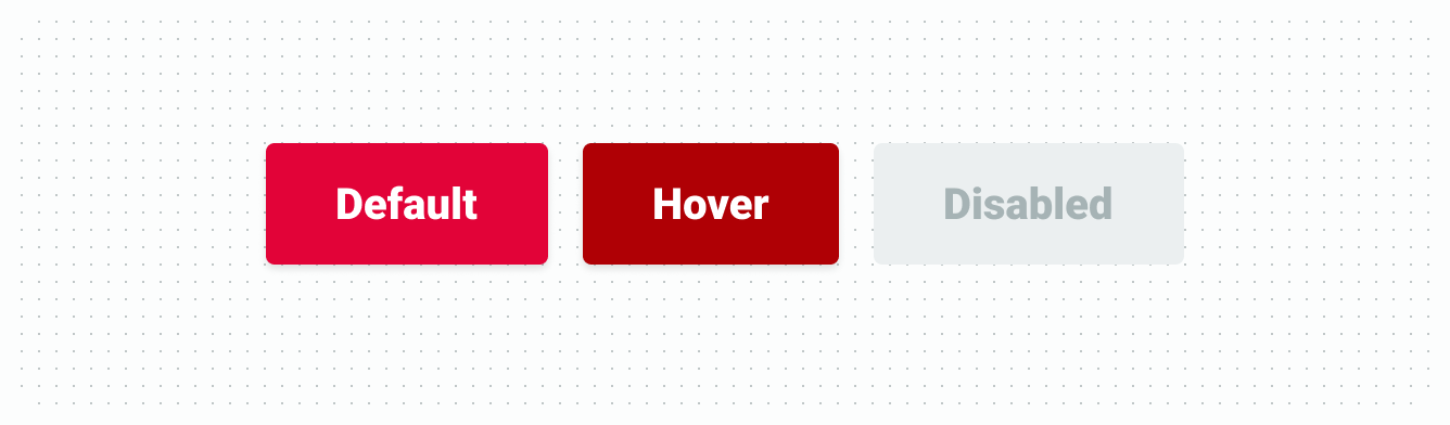
| Element | Property | Color token |
|---|---|---|
| Label | Text | $color-text-inverse |
| Container | Background | $color-action-danger-primary |
| Container (hover) | Background | $color-action-danger-primary-hover |
| Container (disabled) | Background | $color-action-disabled |
| Label (disabled) | Text | $color-text-disabled |
Tertiary danger button
| Element | Property | Color token |
|---|---|---|
| Label | Text | $color-action-danger-primary |
| Label (hover) | Text | $color-action-danger-primary-hover |
| Label (disabled) | Text | $color-text-disabled |
Primary success button
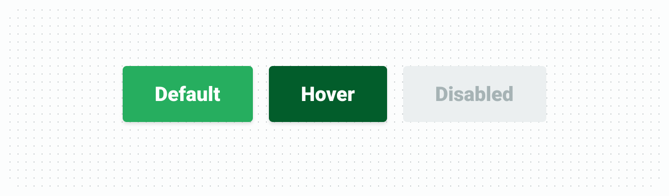
| Element | Property | Color token |
|---|---|---|
| Label | Text | $color-text-success |
| Container | Background | $color-action-success-primary |
| Container (hover) | Background | $color-action-success-primary-hover |
| Container (disabled) | Background | $color-action-disabled |
| Label (disabled) | Text | $color-text-disabled |
Primary info button
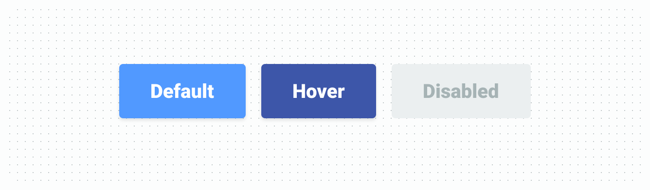
| Element | Property | Color token |
|---|---|---|
| Label | Text | $color-text-info |
| Label (disabled) | Text | $color-text-disabled |
| Container | Background | $color-action-info-primary |
| Container (hover) | Background | $color-action-info-primary-hover |
| Container (disabled) | Background | $color-action-disabled |
Primary neutral button
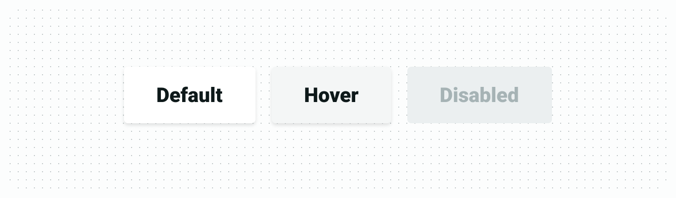
| Element | Property | Color token |
|---|---|---|
| Label | Text | $color-text-default |
| Container | Background | $color-action-inverse |
| Container (hover) | Background | $color-surface-grey-normal |
| Container (disabled) | Background | $color-action-disabled |
| Label (disabled) | Text | $color-text-disabled |
Secondary neutral
| Element | Property | Color token |
|---|---|---|
| Label | Text | $color-action-brand-primary |
| Container | Border | $color-border-normal |
| Container (hover) | Border | $color-border-high |
| Container (disabled) | Border | $color-border-normal |
| Label (disabled) | Text | $color-text-disabled |
Structure
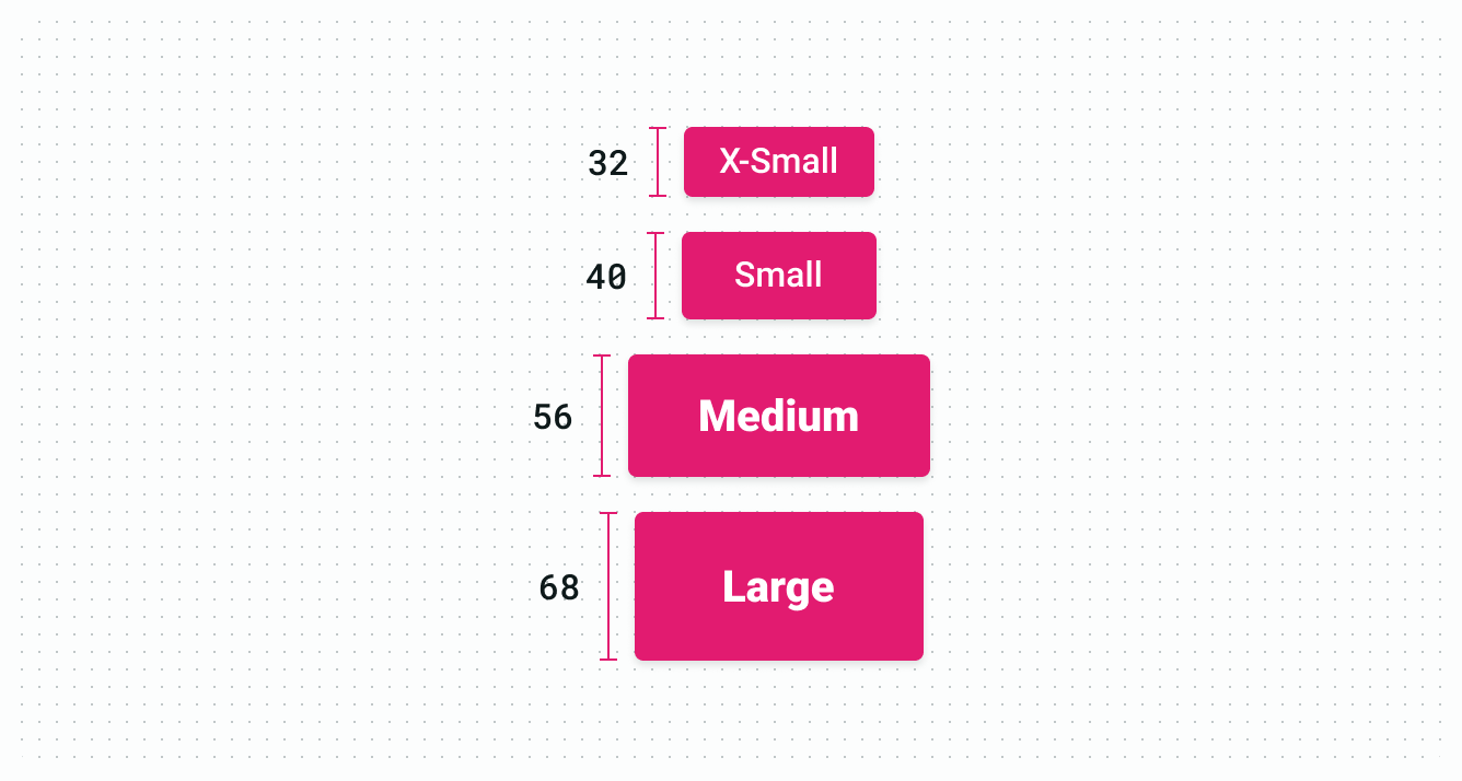
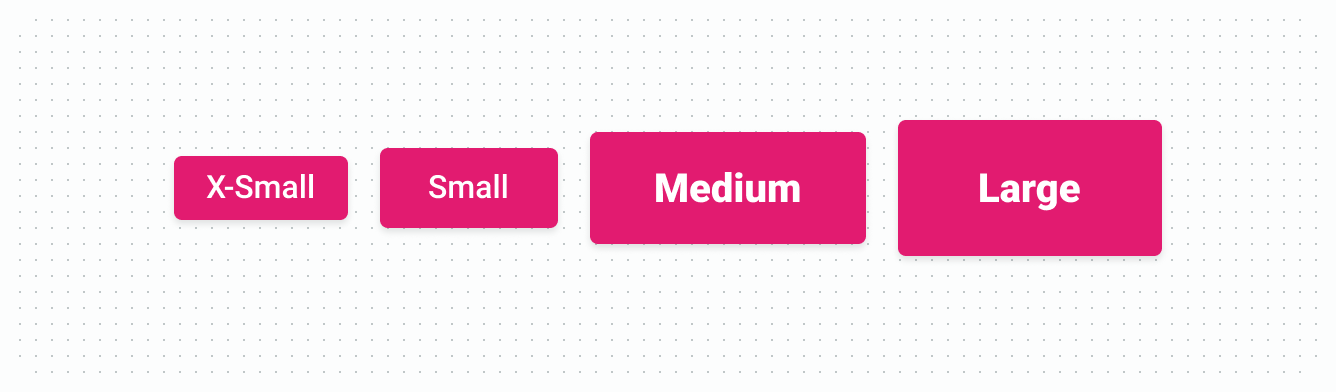
Size
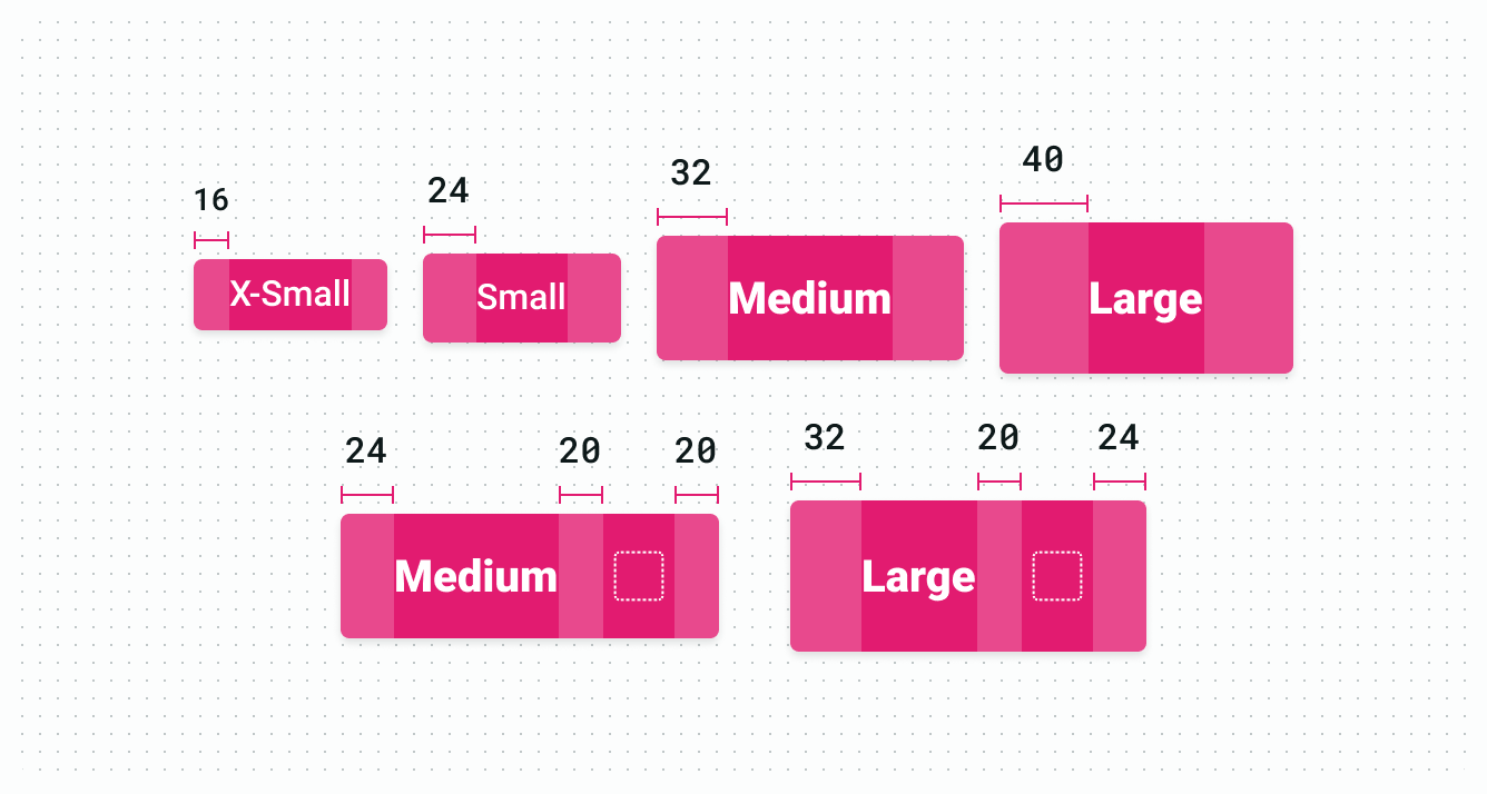
Spacing
Typography
| Element | Size & weight | Type token |
|---|---|---|
| Button text (small, x-small) | 16px, Medium | $typography-body-1 |
| Button text (medium, large) | 20px, Black | $typography-heading-5 |