Label
A label is a visual indicator used to highlight an item's status or communicate non-actionable, supplemental information.
Color
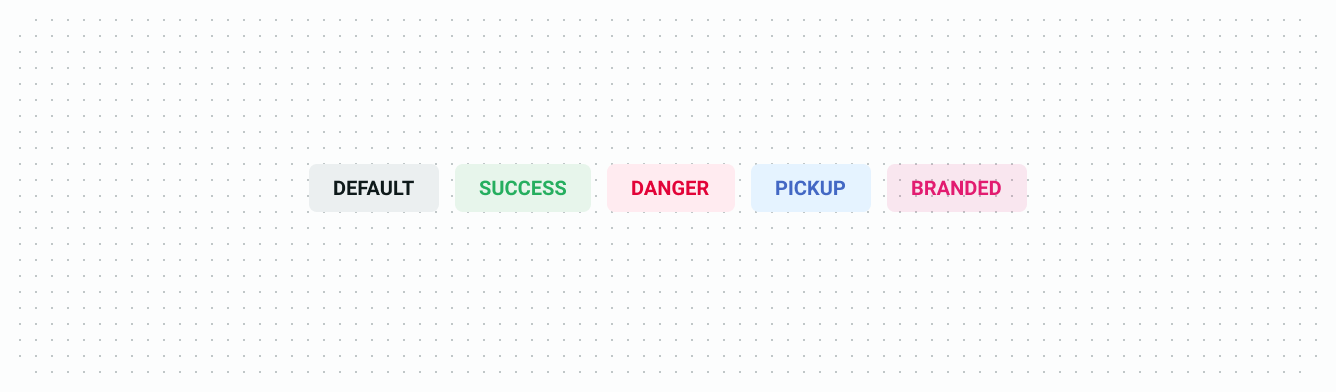
| Element | Property | Color token |
|---|---|---|
| Label (default) | Text | $color-text-default |
| Label (success) | Text | $color-text-success |
| Label (danger) | Text | $color-text-danger |
| Label (pickup) | Text | $color-text-pickup |
| Label (branded) | Text | $color-text-branded |
| Container (default) | Background | $color-surface-grey-high |
| Container (success) | Background | $color-status-success-low |
| Container (danger) | Background | $color-status-danger-low |
| Container (pickup) | Background | $color-status-pickup-low |
| Container (branded) | Background | $color-status-branded-low |
Structure
Size

Spacing

Typography

| Element | Size & weight | Type token |
|---|---|---|
| Label text (small, medium) | 10px, Bold | $typography-tag |
| Label text (large) | 12px, Bold | $typography-caption |